-
01
Started from marketing’s analysis of why leads were low.
-
02
Pitched a working page built with Claude, not slides.
-
03
Designed it once in Figma as reusable blocks.
-
04
Shipped it in Storyblok, so later pages reuse it.
The page did not convince anyone, and a one-off redesign would only ever help one course.
It is the entry point for most Academy traffic, so failing to make the case there was expensive.
Where the page was starting from
of site visitors became leads
asked for the brochure
to take a page from design to live
leads in the analysis that became the brief
The page asked for your details before it said anything
Only 0.25% of visitors asked for the brochure. The top of the page wanted five form fields before saying anything worth giving details for.
Every course page was built from scratch
Every page rebuilt its curriculum section from scratch, so nothing was shared and nothing improved. A new page took about two weeks.
The page, end to end

Scroll insideThe page as it stood when the analysis landed. The old one is gone, replaced by this.

Scroll insideCaptured today, so it shows later work too. Two rebrands came after; the structure held.
So we prototyped it first
AI was used to make the pitch, not in the product. Nothing AI-powered shipped on the page.

Scroll insideA working page argues faster than a deck. The curriculum here is what shipped.

Scroll insideThe same page resolved in Figma, settled once for every page after it.
The first thing I owned was the curriculum framework
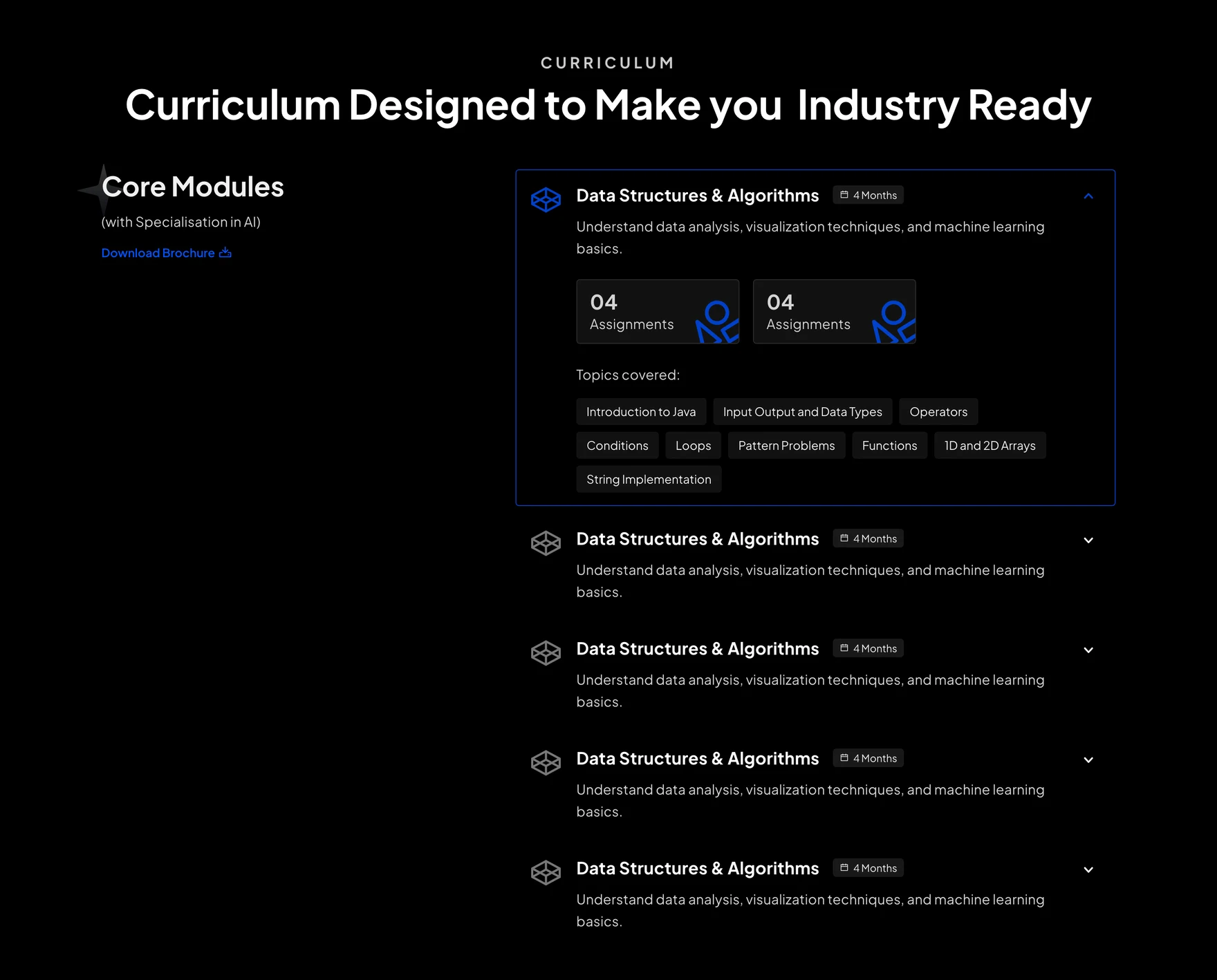
The curriculum section listed modules, but never showed where a course started or where it led.
I want to see where this course starts and where it leads, so that I can tell whether it is meant for me before giving my details.
What was wrong with it
Replaced- 01 No entry point Beginners and working coders saw the same list, with no hint where to start.
- 02 Every module read alike Rows ran the same length in near-identical words, so nothing stood out.
- 03 Order without progression A drop-down implied order but not difficulty, so the path stayed hidden.
- 04 Rebuilt every time Every course page rebuilt it from scratch, so a fix helped only that page.
A path, not a topic list
Three levels that show where the course leads

Built once, for any page to fill in. Still live today, two rebrands later.
Why the structure did the convincing
A list can’t answer ‘is this for me?’
It said what was covered, never where you would start or end up.
Tiers as entry points
Beginner, Intermediate and Advanced come first, so the path reads before the modules.
One shape for every course
Courses gave up their own styling. In exchange, one fix improves all of them.
Then I shipped it on Storyblok
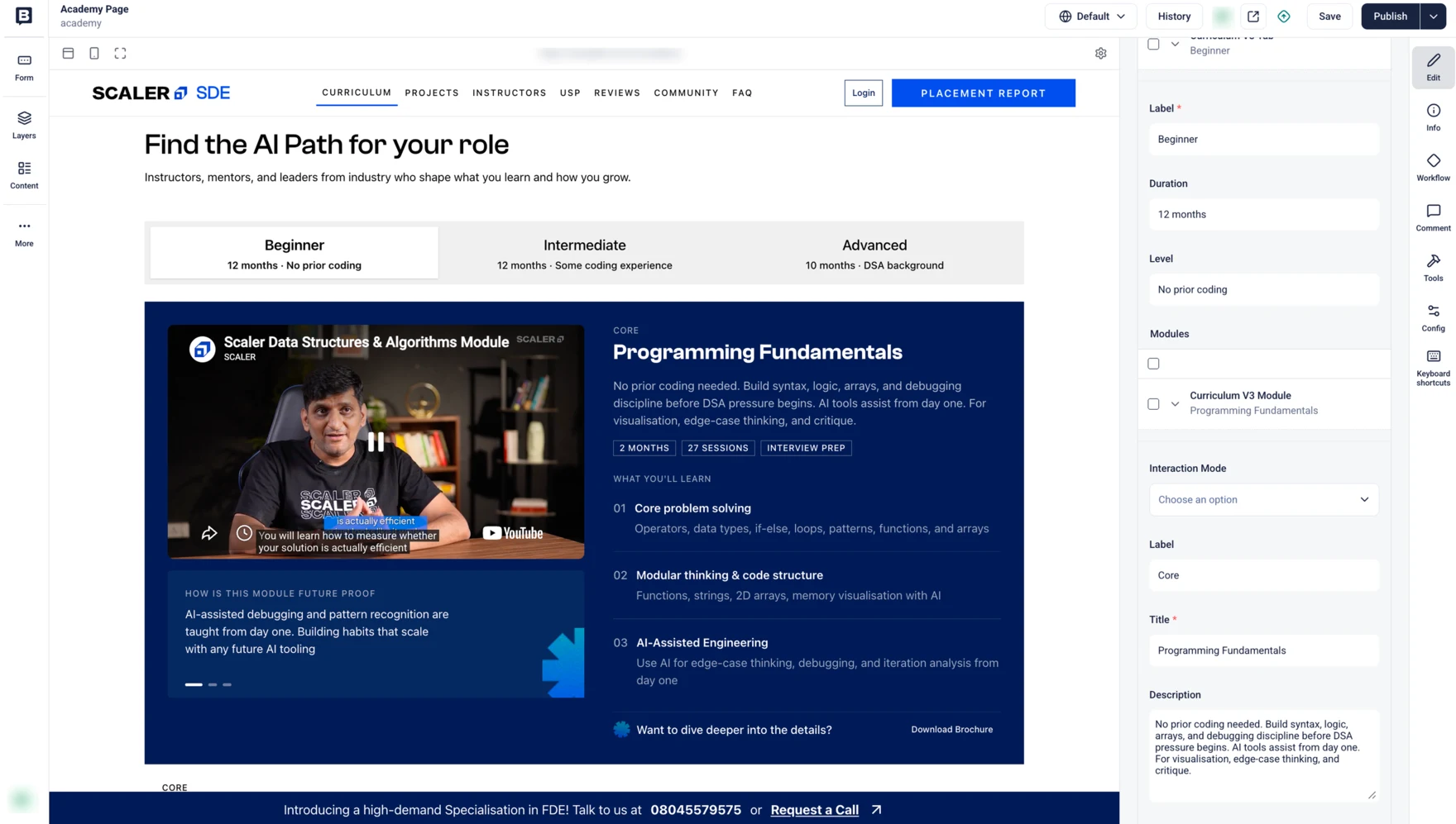
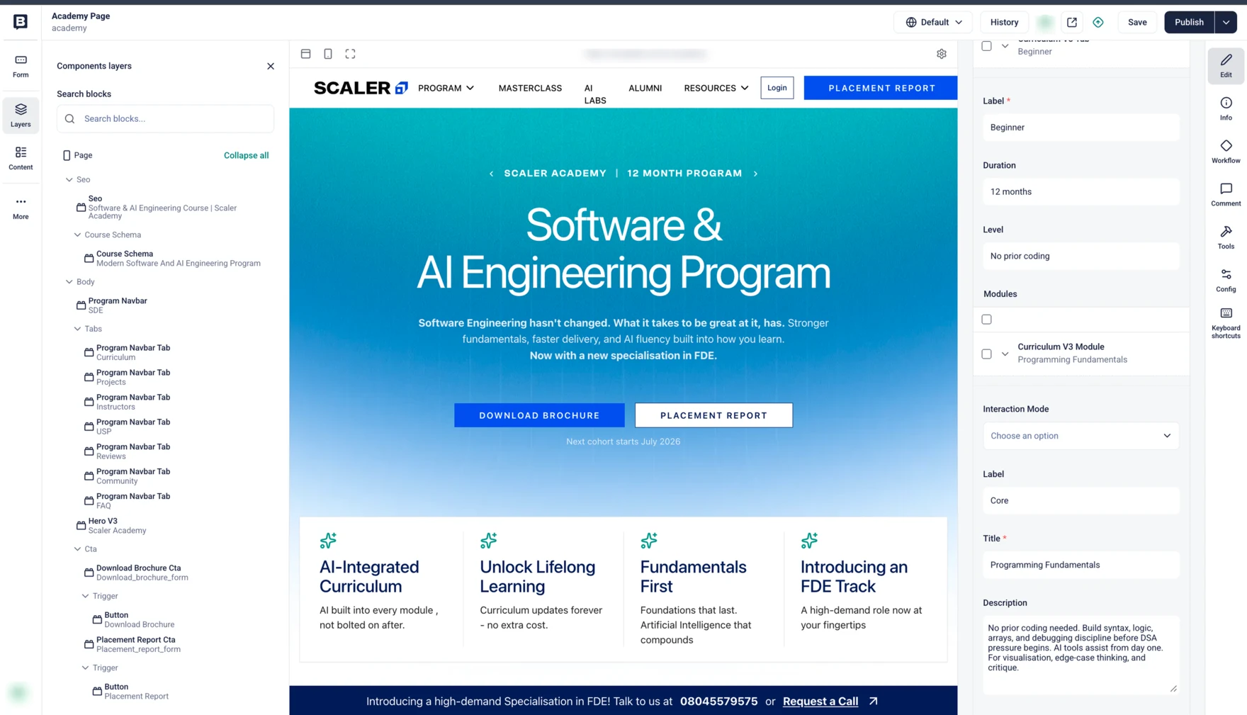
One block holds a label, a length, a level and its modules. I learned Storyblok for this and built the page myself. A second course page was later built from the same blocks, which is what proved it was a system.
to take a page from design to live. An internal estimate, not a tracked number, covering the two pages I built.
---
name: storyblok-program-page
description: Use when creating a new Varsity
  program page in Storyblok from a proposal doc
  or brochure: drafting section copy, expanding
  the curriculum, generating brand images, and
  uploading the page as a draft under an
  institution folder.
---

CORE PRINCIPLE
  Clone for structure, replace only content and
  images, never publish.

HARD RULES, never violate

1. DRAFT ONLY. Every create or update sets
   publish: 0. Never call a publish op.

2. CONTENT APPROVAL GATE. Do not write copy into
   Storyblok until the content doc and curriculum
   sheet are approved. Images are the only thing
   uploaded directly.

3. NEVER MODIFY THE CLONE SOURCE. Read it, copy
   its content, never write back to it.

4. DO NOT CHANGE STRUCTURE. Keep every component,
   field and section order from the clone. Only
   the values change.
A team call took the form out of the hero
Who did what
The team’s decision: Kishan Vagale (lead), Sudhanva Acharya, Prachi Pandey. Included because it shapes how the numbers read, not as my work.


What moved after we shipped
more people asked for the brochure, 0.25% to 2.33%. This one is the new button alone
of visitors became leads, up from 2.38%. This one belongs to the whole redesign
asked for the brochure from the curriculum section, more than any other section
scrolled as far as the curriculum, about 25,000 people
to take a page from design to live on the CMS, down from 4–6 weeks
What I would carry forward
A better page helps once. A better way of building them helps every time.
A prototype is the cheapest way to win an argument. Mine was approved before I designed anything.
Saying which number is mine and which is the team’s makes the rest believable.
