← All work

Building a coding-challenge dashboard that scales across hiring rounds and products, in three days.

A hiring company needed candidates to pass its own coding test. I built the dashboard that runs it — without Figma, without a design team, in three days. 130 attempts and 115 passes so far.

I wrote the constraints, the model built to them:

  • Pool sizes and pass thresholds
  • Where a wrong answer sends you
  • What carries forward between levels
Tools Claude VS Code GitHub Vercel

An exploration, not a shipped case study. The prototype is built and handed to developers for hard-coding and release.

The full arc, start to resume. Rules, contest, a wrong answer, practice, and the way back.

Where a candidate starts
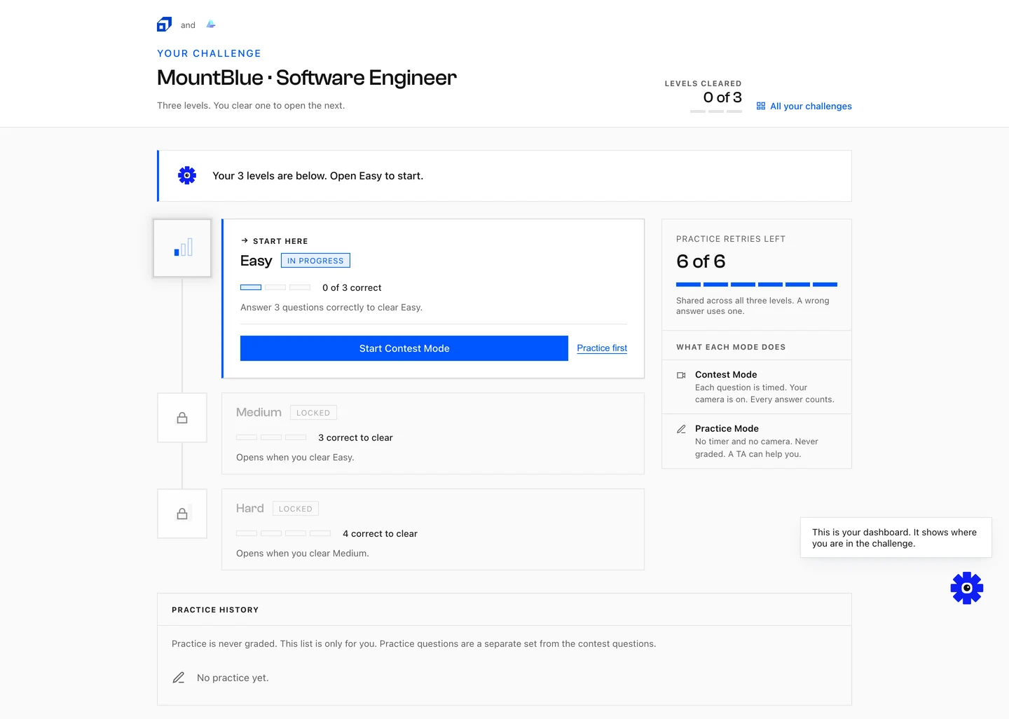
3 days · full flow, edge cases included
Placement Challenge dashboard: MountBlue Software Engineer challenge with Levels cleared 0 of 3, an Easy level in progress with Start Contest Mode and Practice first actions, locked Medium and Hard levels, and a panel explaining what each mode does.

The work at a glance

My role
Product designer
Scope
Placement challenge · full flow, edge cases
Built in
3 days · Claude, no Figma file

How it came together

  1. 01

    Read the brief and never opened Figma.

  2. 02

    Gave the model its constraints before any generation.

  3. 03

    Built it in VS Code, live on Vercel in three days.

  4. 04

    Corrected what the model got wrong for first-time users.

I wrote the constraints first and the markup second

Three decisions made the prototype usable. The rules, the first run, and the recovery.

Beat 01

When the placement PRD landed I did not open Figma. I built a custom Claude skill encoding Scaler’s design system — components, spacing, the mascot toolkit — so anything generated came out inside the system rather than next to it.

Then I wrote an implementation-plans.md translating the learner-facing requirements into a flow: category order, what happens on a wrong answer, when a correct count carries forward, when a category closes.

I sketched that flow myself first, then let Claude build it out against those constraints — straight into a working prototype the front-end could pick up directly. Full flow, edge cases included, in three days.

implementation-plans.md
## Challenge rules

### Category order
- Easy, then Medium, then Hard. Fixed.
- A category opens only once the one before it closes.

### On a wrong answer
- The miss is not graded and not deducted.
- Route into Practice Mode, same interface.
- Practice is required, not offered. No skip.

### What carries forward
- Every correct answer already banked stays banked.
- The correct count carries across the practice detour.
- One miss still clears the round.

### When a category closes
- Threshold met -> close it, unlock the next.
- Six tries spent -> the attempt ends here.

The rules existed before the code did. I decided the edge cases; Claude only carried them out.

Beat 02

The first pass Claude generated assumed a returning, already-familiar user. It dropped candidates straight into Contest Mode with no onboarding at all.

That is a reasonable default for a model working off a PRD written for someone who already knows the product. It breaks for the actual audience: a candidate hitting this cold, for one company, once.

I caught it and rebuilt in a first-time-user experience — the rules screen, the mode explainer, the ‘you cannot skip this’ framing — before any contest question loads.

Beat 03

The harder problem was not the state logic. It was managing how a learner feels at the exact moment they fail, under a timer and a camera.

A wrong answer routes into Practice Mode, but I kept it in the same interface rather than a separate space, framed clearly as ‘not graded’ rather than a step down.

Right at that transition — the moment most likely to spike anxiety or make someone want to quit — the copy says it directly: you keep the answers you already got right, your contest progress is safe. And the way back is never ambiguous; a ‘Continue’ or ‘Back to Contest Mode’ always tells the learner exactly when they are clear to resume.

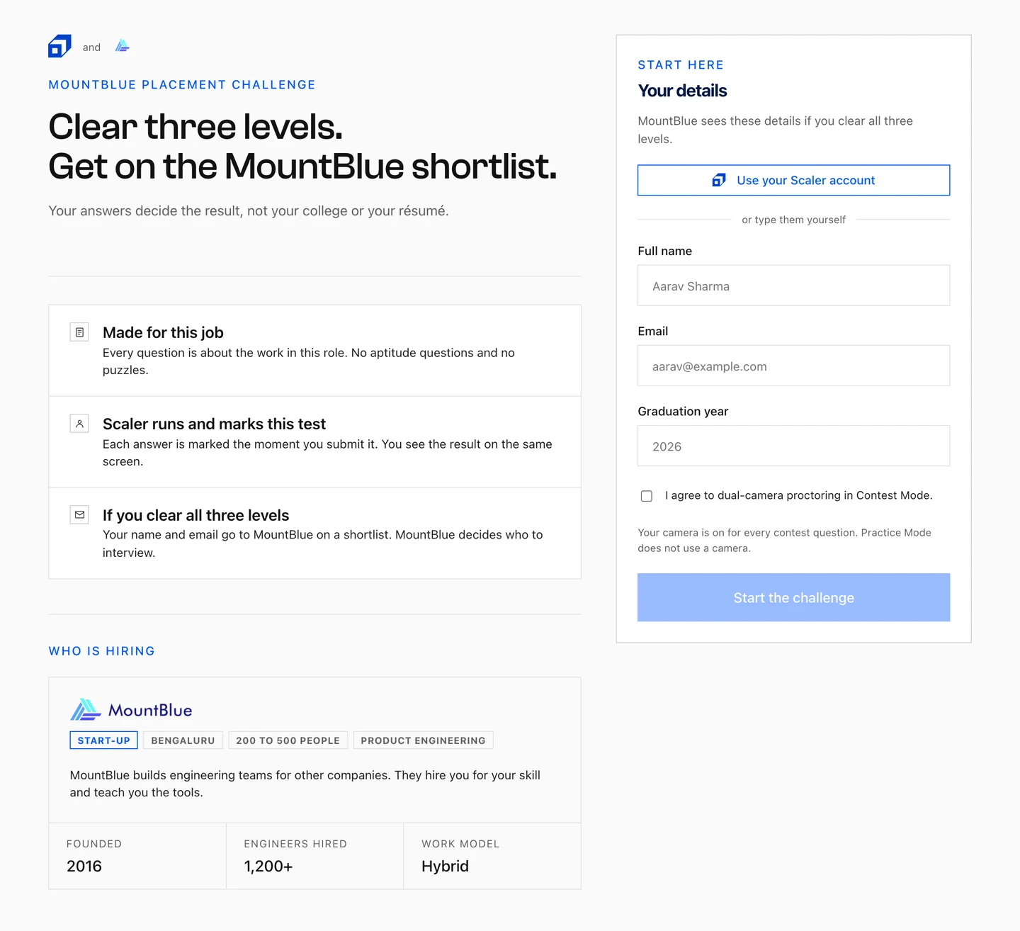
The rules and onboarding screen added before any contest question loads: Clear three levels, get on the MountBlue shortlist, with rule cards for Made for this job, Scaler runs and marks this test, and If you clear all three levels, next to a Your details intake panel with a proctoring consent checkbox.
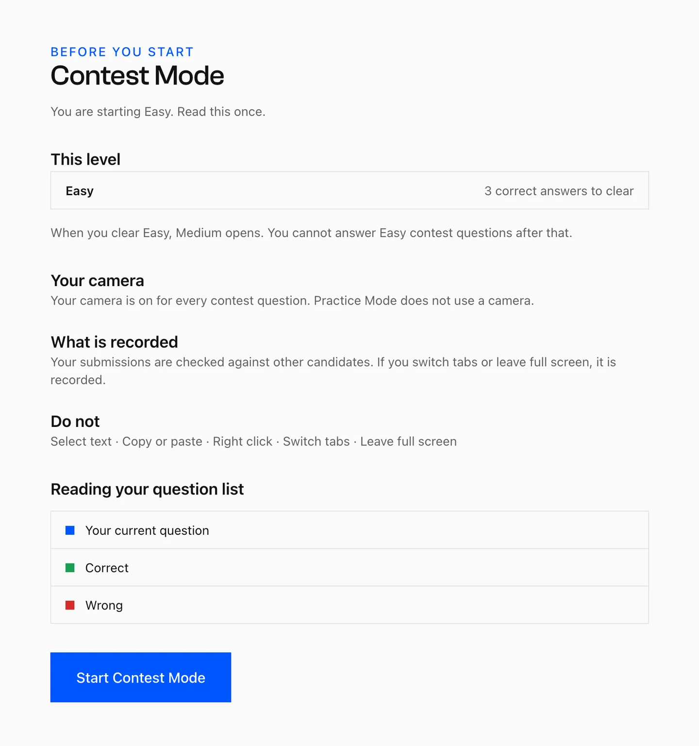
Before You Start screen for Contest Mode, stating the level threshold, that the camera is on for every contest question, and what is recorded.

The conditions the learner has agreed to before the first question. Timer and camera on.

Four screens that keep one promise
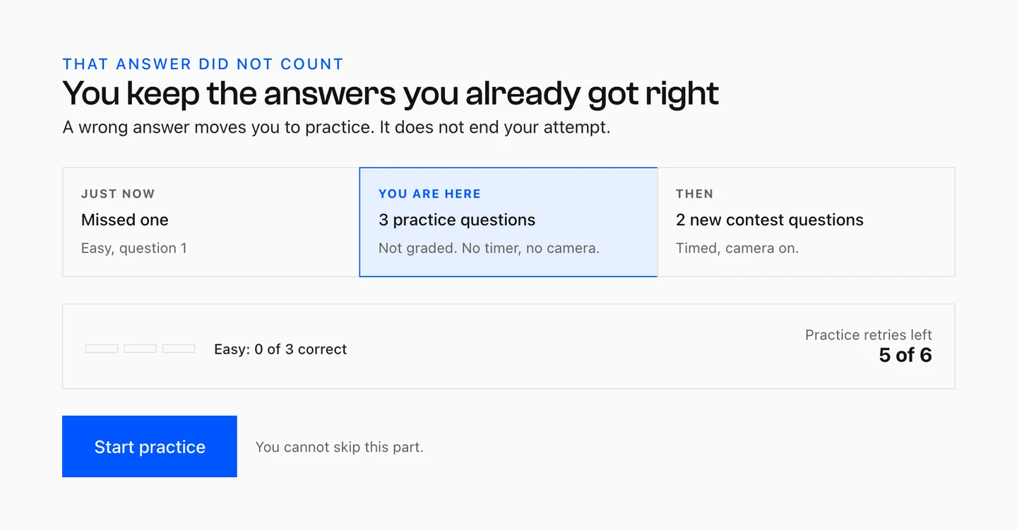
01 Wrong answer
Wrong-answer transition screen headed That answer did not count, You keep the answers you already got right, with a three-part map showing Missed one, You are here 3 practice questions not graded, and Then 2 new contest questions, plus Start practice and the line You cannot skip this part.

A wrong answer never takes away a right one. One miss still clears the round.
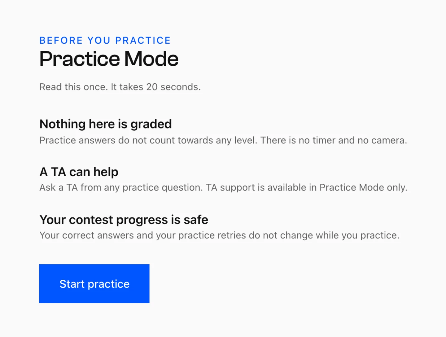
02 Practice framing
Before You Practice screen for Practice Mode with three reassurances: Nothing here is graded, A TA can help, and Your contest progress is safe.

Practice changes nothing in the real test, but the detour after a wrong answer is not optional.
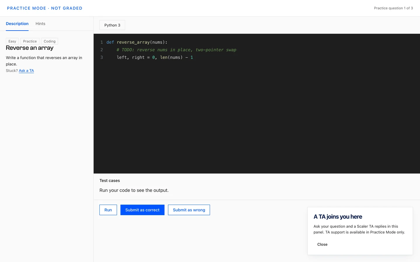
03 Same interface
Practice Mode question in the same editor interface as Contest Mode, labelled Practice Mode, not graded, with the TA panel open explaining that a TA replies here and that TA support is available in Practice Mode only.

The same editor, no camera. Practice uses different questions, so rehearsing costs nothing.
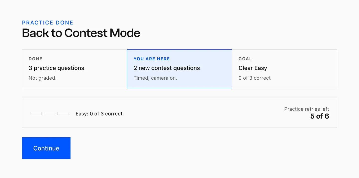
04 Clear to resume
Practice Done screen headed Back to Contest Mode, showing 3 practice questions done and not graded, 2 new contest questions next with timer and camera on, the goal of clearing Easy, and a Continue button.

Each detour spends one of six tries. Spend the last and the attempt ends here.

A PRD on one side and commits on the other

The document set the behaviour; the repo holds every decision that followed it, one commit at a time.
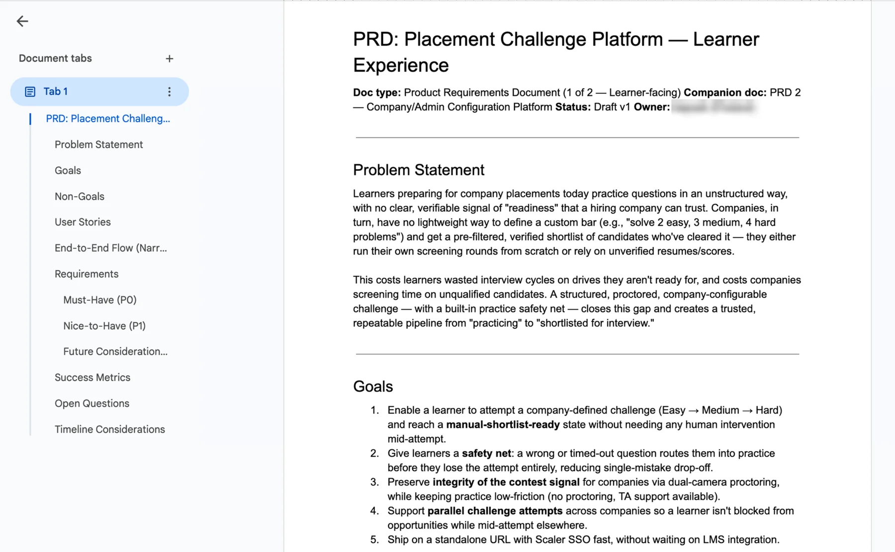

The brief Someone else’s PRD
The product requirements document this entry was built from, open in Google Docs: PRD Placement Challenge Platform, Learner Experience, with a Problem Statement about learners having no verifiable signal of readiness, and Goals covering an Easy to Medium to Hard attempt, a practice safety net after a wrong answer, dual-camera proctoring for contest integrity, and parallel attempts across companies.
The build A spec, a session, a commit log
The working session in VS Code: a Claude Code conversation committing and pushing a single changed file, a design spec open beside it headed Contest Experience, UX Restructure and Full Copy Rewrite, and a source-control graph of scoped commits covering entry copy, level art, cooldown fixes, timer accessibility and rewritten instruction screens.

The PRD is not mine. It defines the state machine, the thresholds and the proctoring rules, and this entry treats all of that as fixed. The design work is everything the document leaves open, which is what a first-time candidate sees and what happens the moment they get one wrong.

Each change is a scoped commit against a written spec, so a decision like ‘cut the landing page’ or ‘rewrite both instruction screens in plainer English’ is a reviewable diff rather than a redraw.

What this entry was testing

01

Can a design system be written down tightly enough for a model to build to it?

Components, spacing and the mascot kit went into a Claude skill. What came out matched the system.

02

Is writing the rules better than asking for edge cases?

Writing the rules down first meant I decided the edge cases and Claude only carried them out.

03

Where do a model’s defaults quietly miss the real audience?

At the start. It built for someone returning, because the brief was written for one.

04

Can you design how a moment feels while working in code, not screens?

It reads right to me, but no nervous candidate has met it on a live timer yet.

Explore next

Shipping a discussion-platform that lets learners reach every stakeholder, instructors to TAs, without switching channels

One dashboard serving four audiences, with the design decisions made in code. Another exploration, this one still to meet its users

The Scaler Conversations dashboard: channels down the left, an active thread in the centre, and the member list beside it