Careers Hub was built for companies to post jobs, but it failed to help learners find suitable jobs and apply.
Posting a role worked fine. Learners were the ones left behind.
Here is how a learner moved through it
- Lands on jobs & sees job card
- Opens job card
- Clicks apply
- Completes application
- Applied successfully
Drop-offs noted in the flow
go on to open a job card
go on to click apply
go on to complete the application
end up applied successfully
About 102 learners a day move through Careers Hub.
Careers Hub should help learners land jobs once their course ends, but many feel stuck and unsure when they try to apply because…
- They only know if they’re eligible, not why.
- They find out if they qualify before they know if the job fits.
- They don’t know if they’re sending their best resume.
So most who open a job never apply, and the few who do don’t know if they sent their best shot.

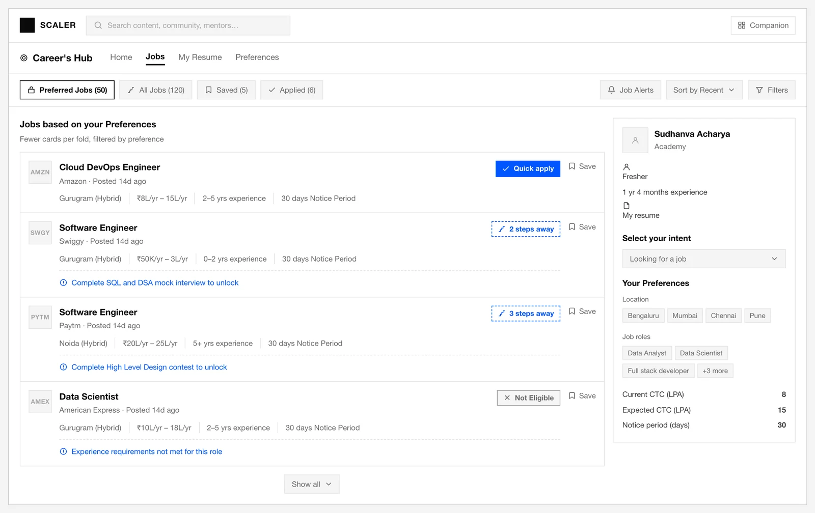
- Cards are set-up in rows of 3 with no clear CTA
- The list had no idea what you wanted. No role, salary or location to sort by, so finding a job worth applying to meant scrolling all 120

- You had to open the job to learn what the tag meant
- The card opens to a checklist, not a reason to want the role
- Qualified learners hesitate afraid of rejection
What we thought would fix it
If learners can see why a job fits, what blocks them, and which resume to send, more qualified learners will apply.
- Primary
- eligible click-to-apply rate
- Secondary
- completed applications
- Guardrail
- applications from ineligible learners
So we went looking for where learners stopped
-

First we read the data
- The funnel showed that everyone opened a card, but only 11.76% went on to apply. One day’s read (7 Nov), pulled early to gauge volume. The funnel above covers a month.
- Across 25+ interviews, three questions kept coming up. Is this job right for me, am I ready, and if not, can I fix it?
- Labels weren’t enough. Learners needed their status and the next step.
- The gap wasn’t confidence in the role. It was confidence in themselves.
-

Then we looked at how other job sites do it
- Naukri and LinkedIn showed one job at a time instead of a grid.
- LinkedIn explained why a profile fit the role before asking for the click.
- Both ranked by profile match, then explained the match back.
The work had to fit inside a few hard limits
- Small team, tight window
- One PM, two engineers, one designer, three months, all on Ant Design, so new patterns reused existing pieces.
- Three stakeholders, one tool
- Learners, the Scaler team and hiring companies share one tagging system. A fix for one couldn’t break the others.
- Nothing shipped without proof
- Every change ran as an A/B split first, so each had to be testable on its own.
The old tags could say no, but never whether it was fixable or final. Now they explain themselves.
I want to know exactly what’s stopping me from applying, so that I can work on fixing it instead of guessing.
Personalised job discovery
Fewer cards, clearer signals for the next action
Shipped
Each label says whether you can apply, and why. The sidebar keeps results relevant without re-filtering.

How we got from the first idea to what shipped
Click the tabs to see each iteration
Reduced the grid to one clear reason
One column, so each status and its next action read at a glance.
Why a label test turned into a full redesign
Clearer labels helped, but people still had no next step.
The next intake created a hard shipping deadline.
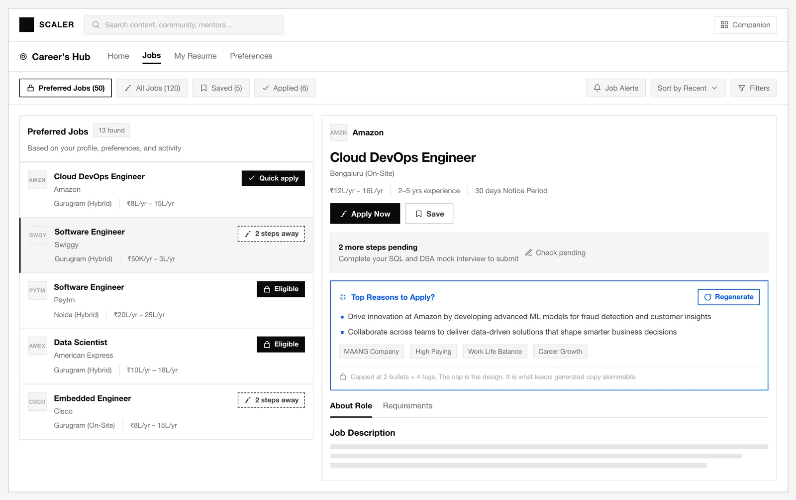
Job listings showed requirements, not why a job was worth wanting. That’s what this fixed.
I want to know why a job suits me before I check whether I qualify, so that I don’t scroll past roles that actually fit.

Reasons to apply sit above the requirements, not below.
Intent before eligibility
LLM-generated job insights matched to each profile
Shipped
Job Highlights now lead with value before the requirements ever show up, so learners see why the job is worth applying for.
A 15% relative increase, among eligible learners who opened a job.
more applications
65 qualified, 7 not qualified
How this idea got to what shipped
Click the tabs to see each iteration
Reduced the insight to one short block
Two lines and four tags made the value clear in seconds.

STRUCTURE = {
  name: "job_profile_highlights",
  parameters: {
    properties: {
      highlights: {
        type: "array",
        description: "An array of 4-6 compelling job
          highlights that showcase the most attractive
          aspects of the role, company, and opportunity"
      },
      keywords: {
        type: "array",
        description: "An array of 4-6 key terms or
          phrases that summarize the job opportunity"
      },
      quality_score: {
        type: "string",
        enum: ["HIGH", "MEDIUM", "LOW"]
      },
      confidence_note: { type: "string" }
    },
    required: %w[highlights keywords
                 quality_score confidence_note]
  }
}

SYSTEM_INSTRUCTION = <<~INSTRUCTION
  You are a career coach helping job seekers quickly
  understand if a role is right for them. Generate
  “Top Reasons to Apply” by analyzing BOTH the Job
  Description AND the About the Company section.

  CRITICAL RULES:

  NEVER hallucinate or fabricate information not
  present in EITHER input

  If information is missing or vague in BOTH sections,
  your highlights MUST reflect that limitation

  For LOW quality inputs, generate 3 minimal
  highlights only (not 5)

  Do not make exaggerated claims

  EXCEPTION: Always add “Career Development” tag for
  fresher/intern/entry-level roles regardless of
  content
INSTRUCTION
How leading with value increased applications
No reason to care yet
It answered ‘can I apply?’ before ‘do I want this?’
Sell the role first
A short block above the requirements.
More qualified applications
Eligible-role click-to-apply rose from 55.44% to 63.82% in a month.
Learners could send any saved resume without knowing which one fit best. A score now tells them.
I want to know which of my saved resumes has the best chance at this job, so that I send the strongest one.
Sharper resume selection accuracy
Applying with the most suitable resume
Shipped
The score compares your saved resumes for this role, so you know which one has the best chance and why.
If the score can’t load Applying isn’t blocked. Continue, or retry the score.

The pilot that justified this
We sent a plain version of the report to 100 learners first.
It landed, so we built it.
Resume fit was the one rejection cause we could move. It still isn’t a callback.
Step 1 - experience_check
  meets_minimum = candidate_yoe >= jd_min_yoe

Step 3 - component_scores
  skills_score              (0-50): coverage + depth
  experience_projects_score (0-50): relevance, seniority, impact

Step 4 - score
  score = skills_score + experience_projects_score
  if not meets_minimum: score is capped at 40

  Bands:
  0-20    profile unrelated to the role
  21-45   major gaps in must-haves
  46-60   partial fit, several requirements missing
  61-74   reasonable fit, missing one or more must-haves
  75-89   strong fit, meets requirements with evidence
  90-100  exceptional fit, clearly exceeds requirements

Step 5 - decision
  candidate_status = "shortlist" if score >= 75, else "reject"
Under the minimum experience the score caps at 40. 75+ is shortlisted.
What moved after we shipped
An A/B split on 4,000 learners, 2,000 to each bucket. Every figure below comes from that split, not a full rollout.
480 applications before, 552 after, a 15% lift that came from the three features together rather than any one. Only 7 came from ineligible learners.
more applications from people who qualified, over a month
more applications in total, 65 who qualified and 7 who did not
of people who qualified clicked apply, up from 55.44%
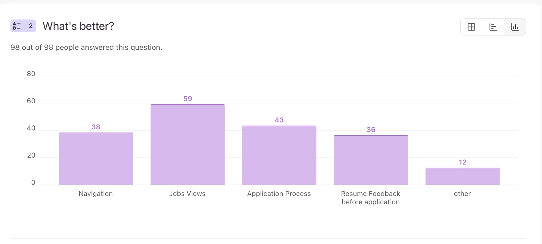
And this is what learners said got better
98 learners answered and could choose more than one area.
The job list before and after

What I would carry forward
A label only helps if it names the next step. “Eligible” never did.
Two rough versions, shown fast and thrown away, got us to the single-card layout.
A 100-person pilot proved the idea before we built it.
What this does not prove yet
- We measured applications, not interviews or hires.
- A month is still too short to speak to job quality.
- Next we track shortlist and interview rates by fitment score.
